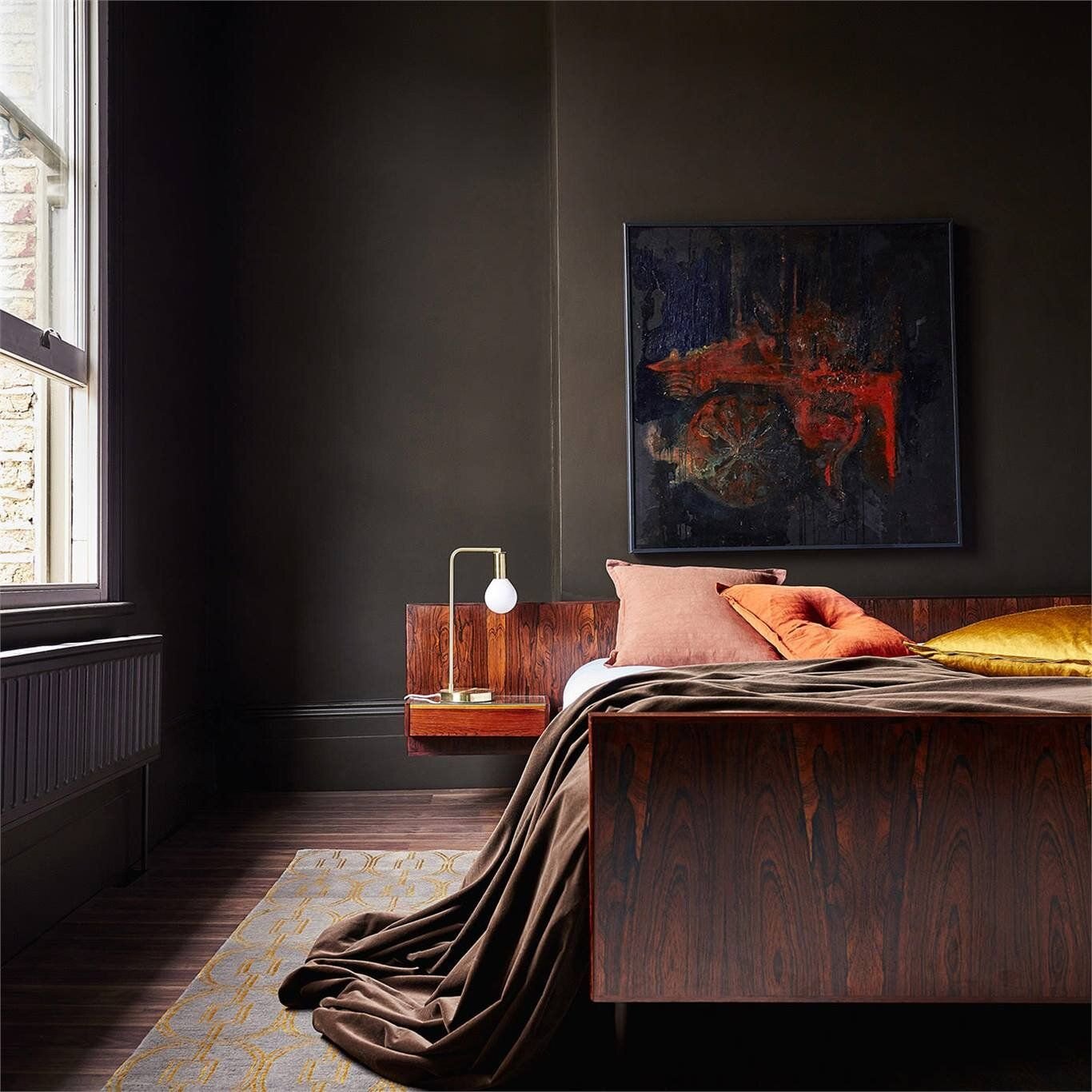
Paint Colour Spotlight: Brown
Last up in my colour spotlight is one of my new favourites: brown.
Is brown a colour? Technically yes (it’s dark shade of orange), and after a decade of grays and cool tones, brown is officially trending (hooray!). I consider lighter browns like taupes and beiges to fall more into the neutral category, but medium and darker tones browns are a bit more of a colour commitment and will be what I’m talking about here.
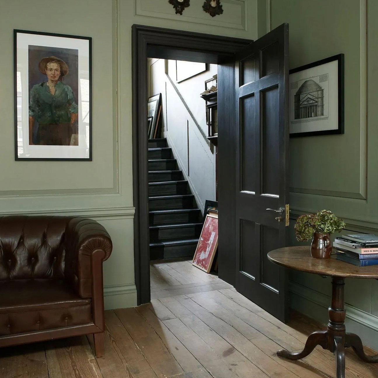
Paint Colour Spotlight: Green
If you’re a lover of neutrals and nervous about incorporating colour into your space, I recommend starting with green. Considered “nature’s neutral” it’s a great way to incorporate colour in a way that doesn’t feel too over-the-top, especially when you stick with soft and muted shades of green.
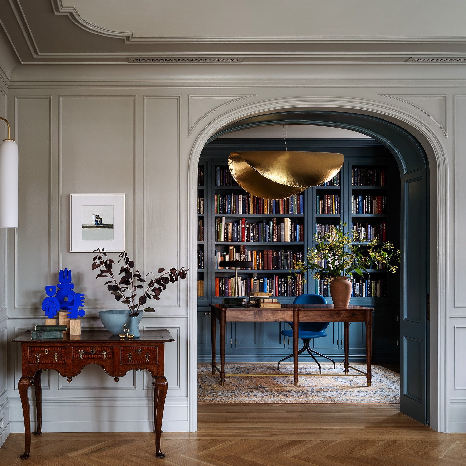
Paint Colour Spotlight: Blue
Today’s colour spotlight is a perennial favourite: blue! This classic hue is probably the colour we feel most comfortable with in our homes. It can be bold or subtle, light or dark, but regardless, this is a colour that feels timeless and approachable.
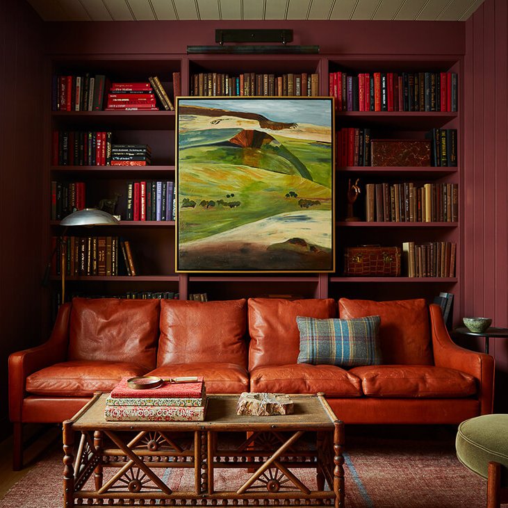
Paint Colour Spotlight: Red
Red (and burgundy in particular) keeps popping up in recent trend predictions and for good reason. We’re moving away from the white walls and cool neutrals that dominated interiors over the past decade towards warm, rich and earthy tones… and nothing beats a deep red for creating a cozy vibe.
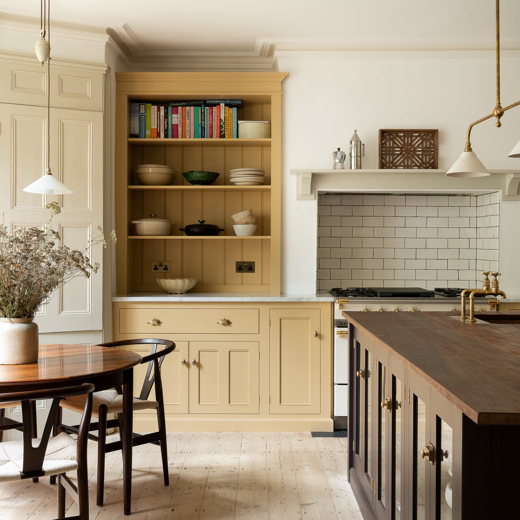
Paint Colour Spotlight: Yellow
Yellow is a well-loved paint colour for the optimistic and cheerful vibe it brings to a space, but it’s also one of the trickiest colours to choose. Why? Because all colours look twice as bright and twice as light once they’re up on your walls. So a yellow that looks perfect on a two-inch paint chip, can end up looking blindingly obnoxious once it’s up on your walls.
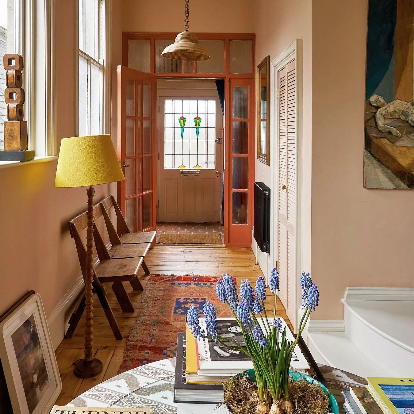
Paint Colour Spotlight: Pink
It’s the time of year that after the holiday decor gets packed away, many of us look around our spaces and feel the need for a little refresh. To kick off 2024, this month I’ll be sharing some colourful home inspiration and rounding up all my favourite paint colours, hue by hue.
The first post in my colour spotlight series is pink! This hue can be a hard sell for many, but hear me out…
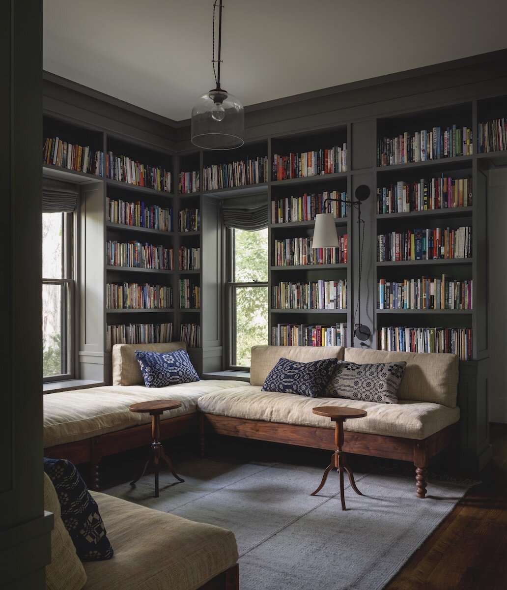
Design Idea: Painting your Trim to Match your Walls
If you’re looking for an affordable way to update your home this fall, here’s an idea to try: paint out your trim to match your wall colour. Sometimes called “colour-drenching”, the look creates the illusion of more space as it allows your eye to move seamlessly around a room.
How to Choose the Right Paint Finish (aka Sheen Level) for Your Home
After much deliberation you finally get your paint colours chosen. You head to the paint store, excited to finally start your project. You wait your turn at the order counter, confidently name your colours…. then you get asked about the sheen for your paint and your mind goes blank.
In this post I’ll share the ins and out of choosing a paint finish or sheen, so that you can feel confident about your choices before heading to the paint store.
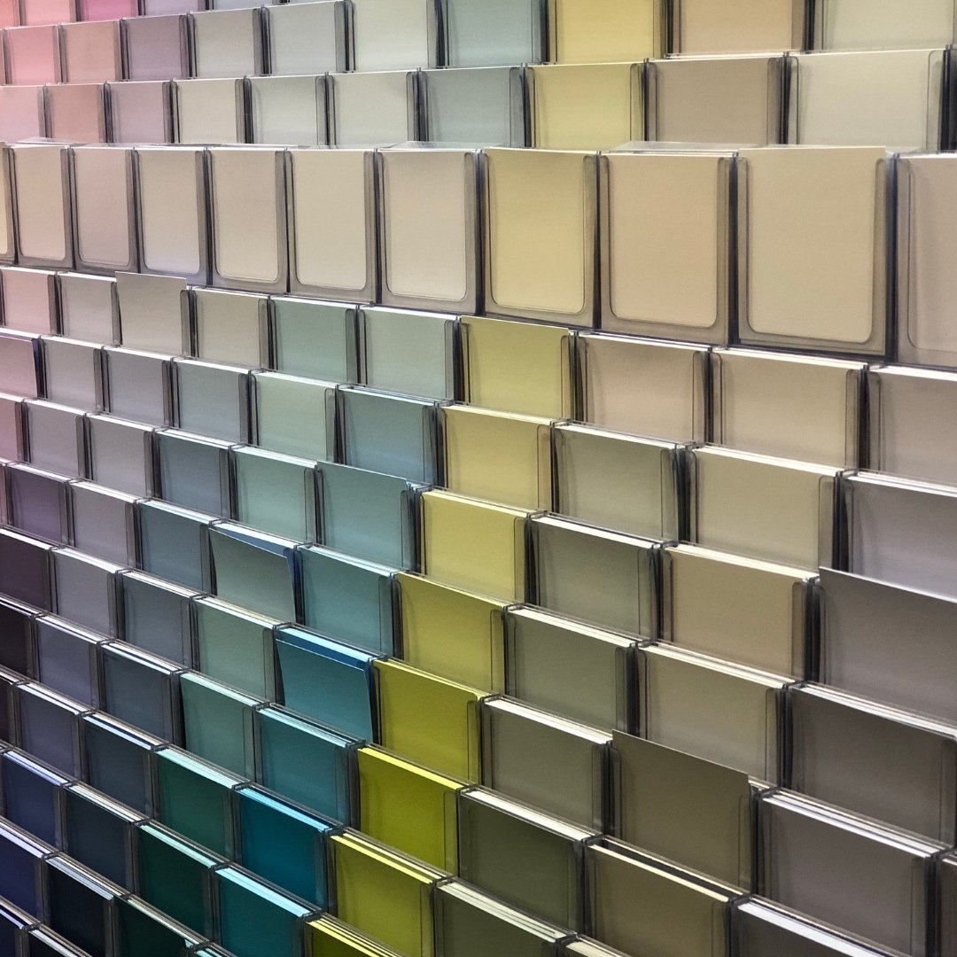
Five Things NOT to do When Picking Paint Colours for Your Home
A big part of my work as a designer is helping people pick paint colours for their homes. And I love talking about colour! But regardless of whether someone is looking for the perfect calm white or a bright and punchy hue, I end up repeating a few pieces of advice every time. Here are five things to remember when picking your next paint colour.
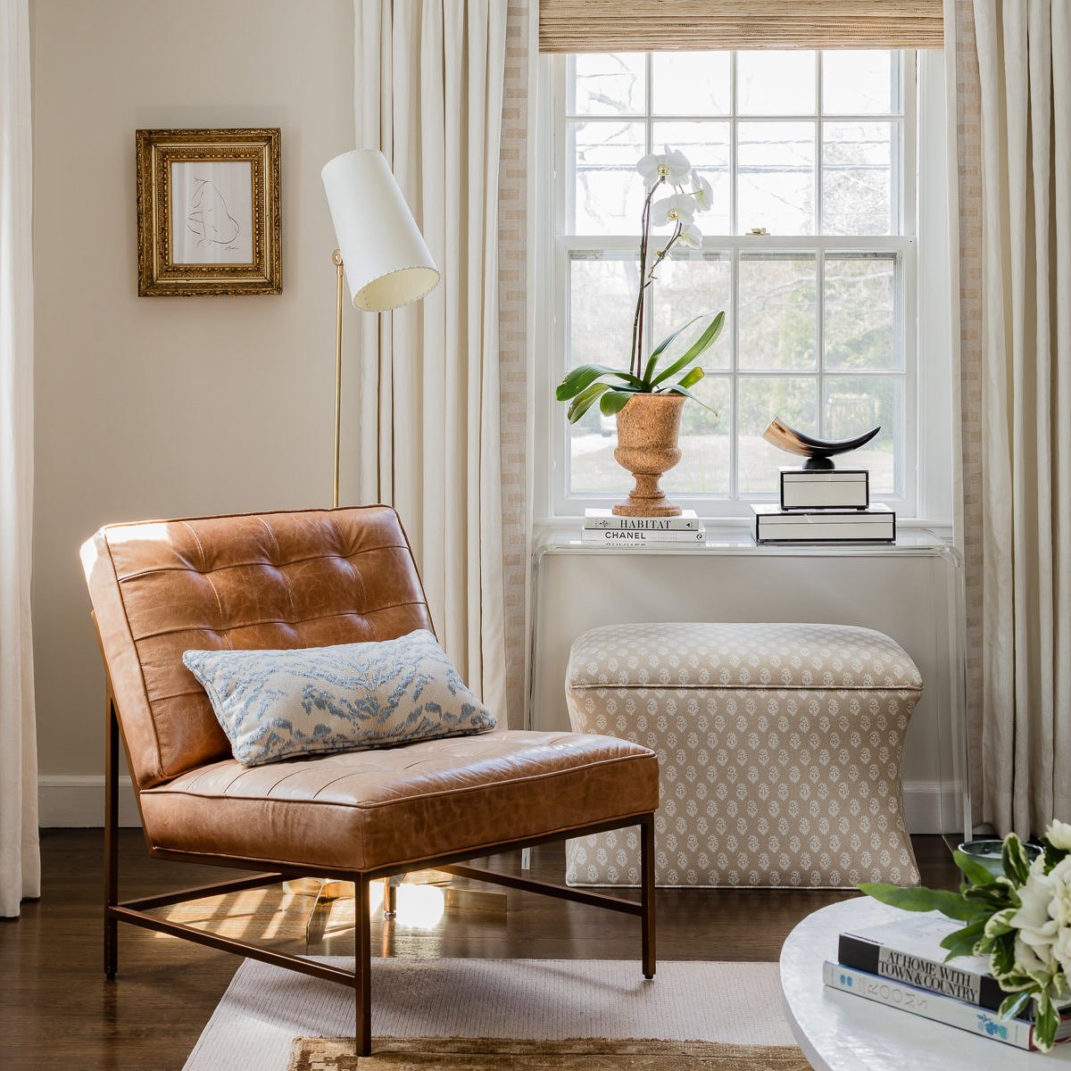
Forget the White Walls: Try These Fresh Neutrals Instead
Pure white walls are still trending in interiors- the look is ethereal, fresh and gives off major Parisian-apartment vibes. But the reality is that for every light-filled white space, there are many many (many!) spaces where white walls look dingy and grey.

My Five Favourite White Paint Colours (and How to Pull Them Off)
Ah- the quest for the perfect white. Ushered in with the modern farmhouse trend, the search for the perfect white is not as easy as it seems. One reason whites are so tricky is because of their differing undertones- hold a white paint swatch up to a white piece of paper and you’ll notice some look more blue, green, grey, pink or yellow.
