Interior Design Trends and Predictions For 2023
Happy New Year! It's that time of year where we step back and take a longer view of where we’ve come from and where we’re going. And since I love design, why not talk for a minute about interior design trends and predictions for 2023. Many of these trends are directions we’ve been seeing for the last few months or years in design magazines and on social media, but for those of us living in real homes with real budgets, these trends are slower to trickle down into our everyday lives and purchasing options.
A lot of people really dislike the idea of trends, and I get it: the fast-fashion-type home accessories that are hot for less than a season can feel pretty excessive. But to some extent, evolving trends keep our homes fresh and interesting, give us a chance to express ourselves through the spaces we inhabit, and tap into the larger social and cultural movements surrounding us. When done thoughtfully, trends shouldn’t leave us broke or be wasteful of the items we’ve already invested in, but help nudge us in a direction for our home that feels right for where we’re at.
So let’s get into it! Here’s my take on home decor trends and design predictions for 2023.
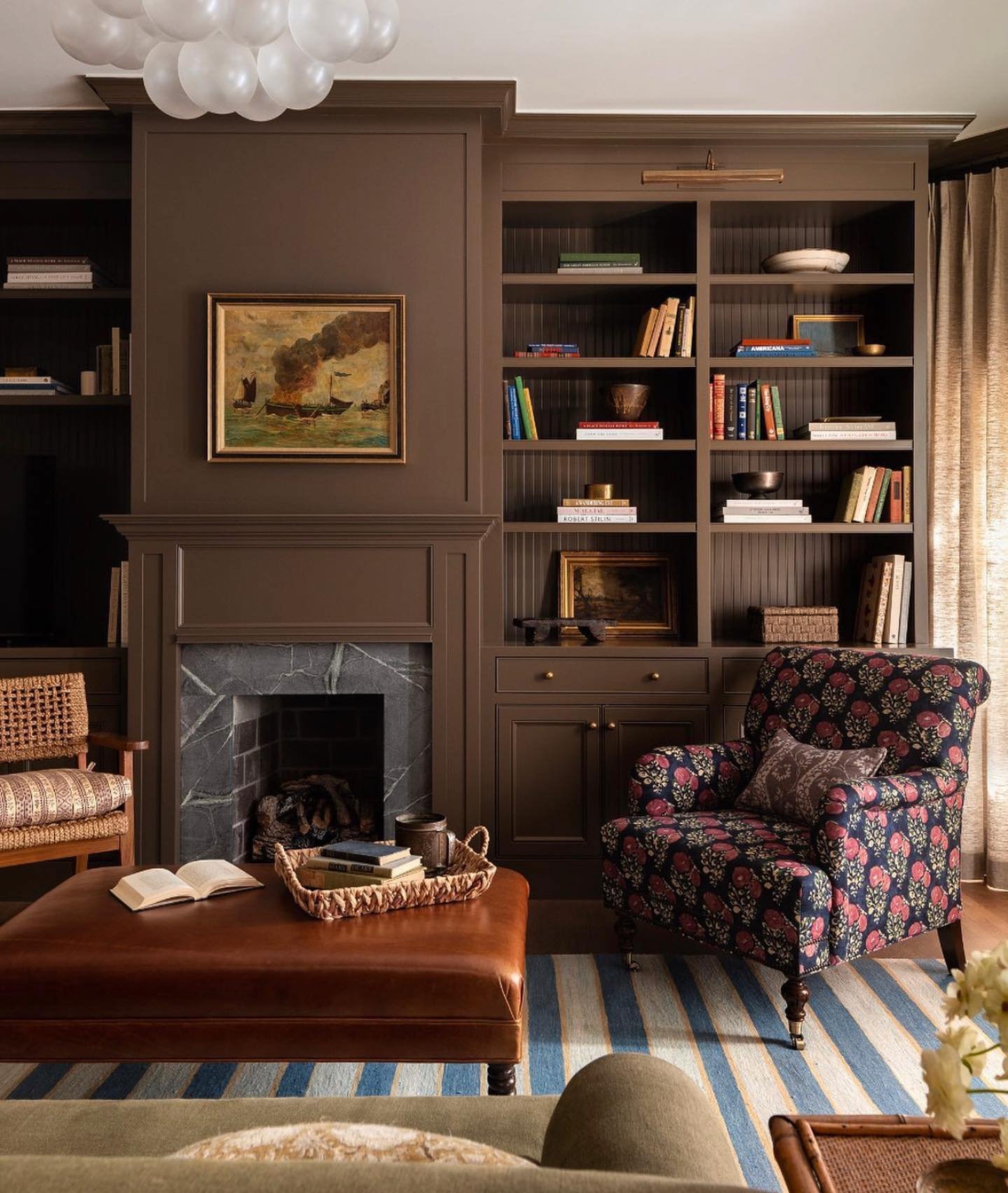
Brown
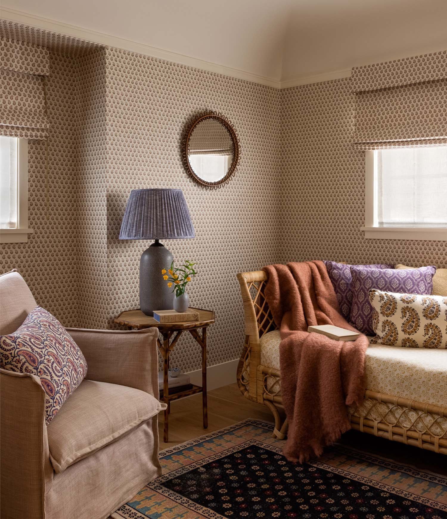
If 2010 was the decade of whites, cool neutrals and fresh colours, 2020 is shaping up to be the decade of earth tones, warm neutrals and muddy hues. It follows then, that brown has replaced cool grey as the go-to neutral. Brown is classic, plays nicely with almost every shade, and is less harsh and more grounding than black.
Image Source: Heidi Caillier Design
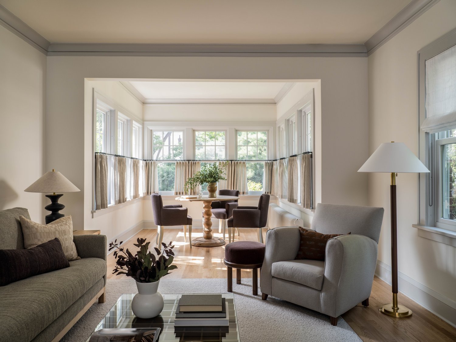
How to try it at home: Ease into brown, especially if, (like me!) you have lots of cool neutrals in your home from the last decade. Brown mixes well with these shades: you can add brown-toned pillows or a throw to your grey sofa, for example. The key to keeping brown fresh is to vary the shades (think beige, sand, taupe, mushroom, camel and espresso) and to mix in some creamy white to keep things from looking too dark.
And if you’re thinking about switching up your white walls to something slightly warmer, check out this blog post- many of the favourite non-white paint colours I recommend are actually just pale shades of brown.
Image Source: Yond Interiors
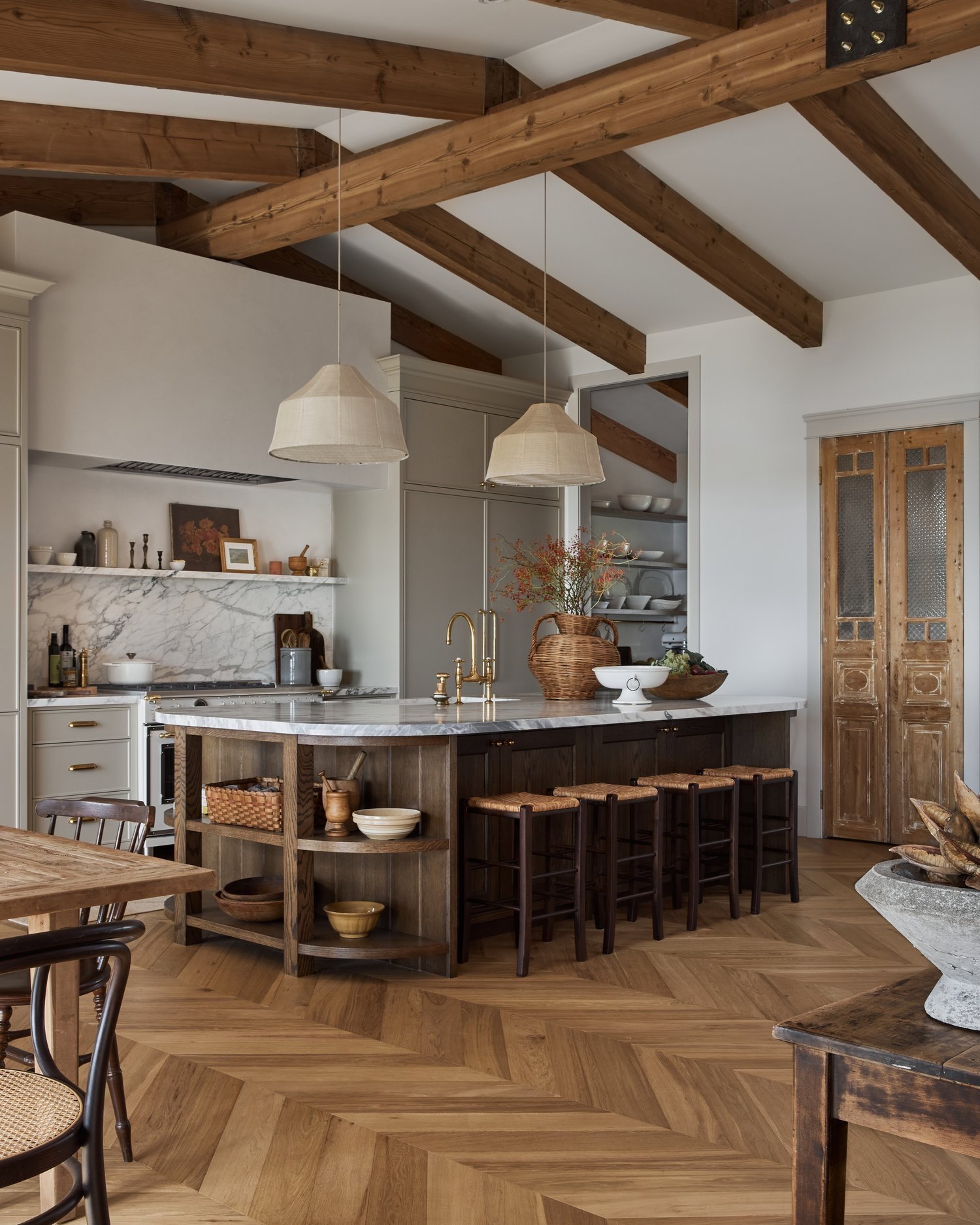
Dark Woods
Just as paint palettes have shifted to warmer and richer hues, medium and dark-toned woods are trending after years of bleached, Scandi-style light woods.
Image Source: Ashley Montgomery Design
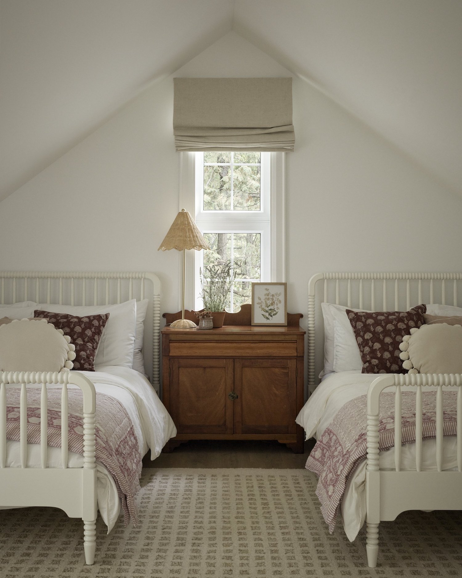
How to try it at home: First of all- don’t feel that your light wood floors are outdated. Just like a forest has many different types of trees, your home can (and should) also have many different types of wood. When mixing woods, make note of their undertones (cool, neutral, or warm tones) and try to stay within the same family. Look to bring in these new darker wood tones through furniture pieces- vintage items in particular can be a very affordable option.
Image Source: Scout & Nimble
When selecting dark wood pieces, consider the species of wood. Walnut is a safe bet for a true brown, while cherry and mahogany read red, and pine and oak read orange or yellow.
Cool Metals
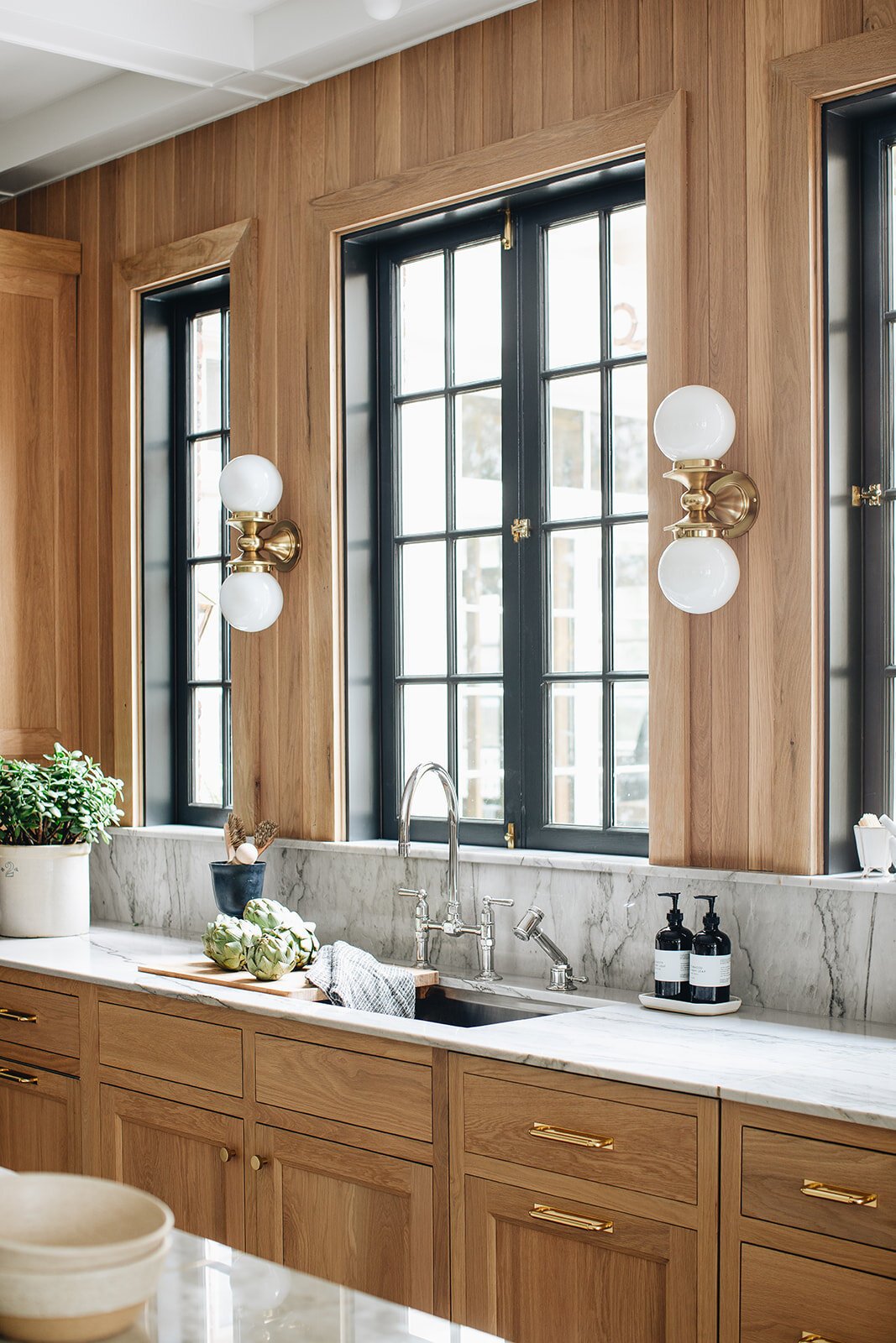
For the last few years brass and gold have been the go-to metal finish, and just as all trends are cyclical, we’re starting to see the return of cool metals such as nickel, chrome, and stainless steel.
Does this mean you need to switch out your brass finishes? Absolutely not. Just like with wood tones, there’s no need to have all the metals in your home match. Mixing metals creates a collected-over-time-look and adds character to a space that would be lacking if all your metals matched.
Image Source: Jean Stoffer Design
How to try it at home: If you’re wanting to add in some silver tones, my favourite cool metal is polished nickel: it’s much warmer than chrome so it harmonizes nicely with brass or gold. Another tip when selecting finishes is to create contrast in the sheen level so the mixing of metals looks intentional. For example, if your bathroom faucet is a polished nickel, try a satin brass for the vanity pulls or light fixtures.
Pattern on Pattern
The cozy grandmillennial and cottagecore trend continues in home decor and fashion, and a key feature of these styles is the abundance of pattern on just about everything! This look is whimsical and often ‘clashes’ but that’s what makes it rich, vibrant and so livable.
Image Source: Meghan Eisenberg
How to try it at home: Unless you’re an aspiring designer, leave the patterned wallpaper-ceiling-upholstery-pillows-lampshade-combo to the experts. Instead, try mixing patterns in smaller doses such as with a collection of throw pillows on your sofa or bed. The key to mixing pattern is picking a colour palette, and then varying the scale and style of the patterns you choose. Check out this post on mixing pattern for more tips and examples.
Image Source: Tiffany Leigh Design
Statement Marble
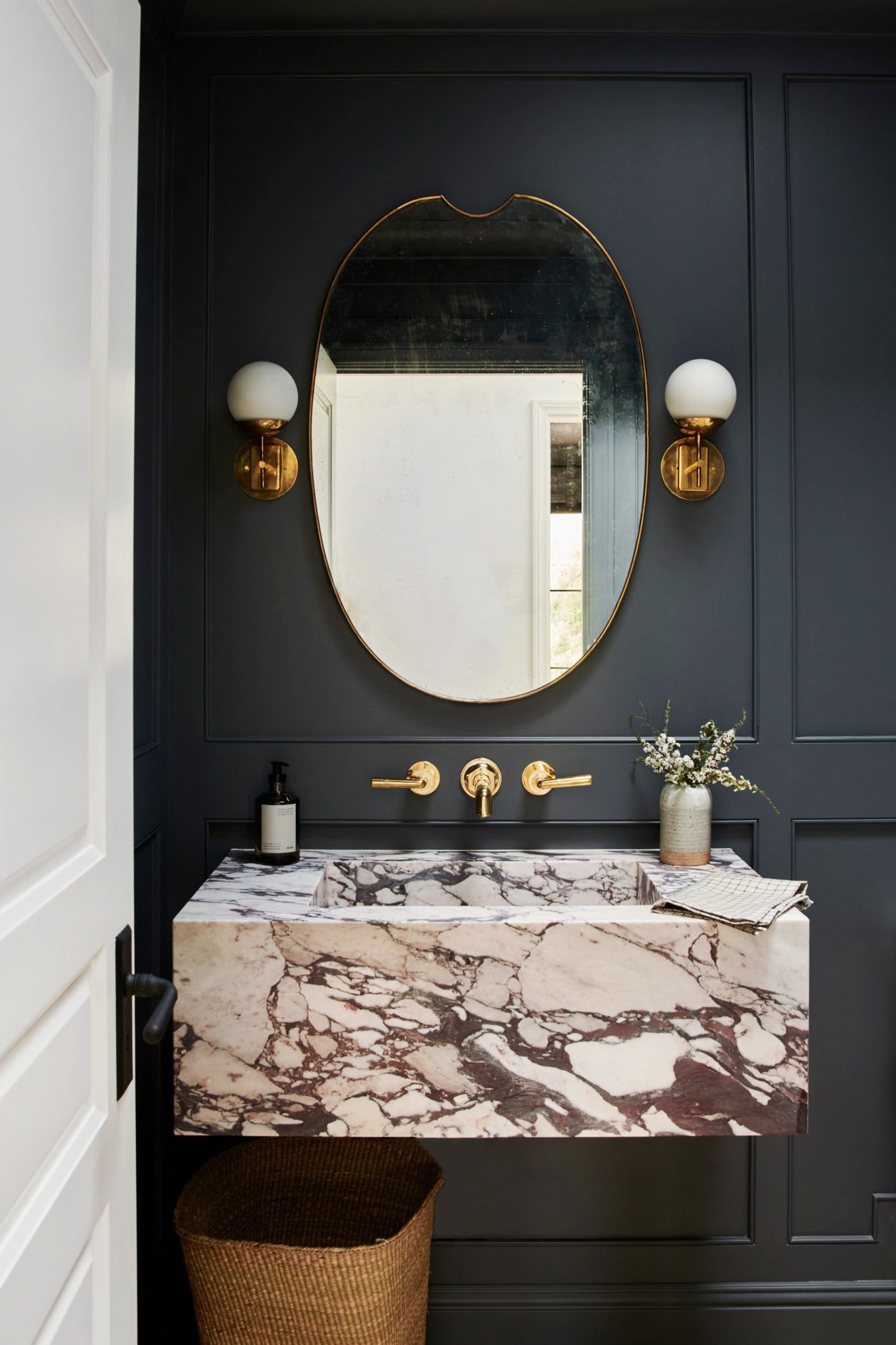
Bold-veined marble finishes are still going strong for 2023, and have appeared in high-end design magazines on everything from bathroom vanities to kitchen countersplashes.
Generally I feel like you can’t go wrong with a natural material as beautiful as marble, but I do wonder if these finishes will appear dated in a few years only because they’re so incredibly popular right now. And while a trend like brown paint is a pretty low commitment (you’ll just need a can of paint to change it up in a few years), a purple-veined marble countersplash is a much bigger and pricier commitment.
Image Source (Vanity): Amber Interiors
How to try it at home: If you’re thinking of a marble slab backsplash but aren’t sure if it will feel dated down the road, choose a slab with more subtle veining in classic neutral tones. Marble tile is another alternative with lots of option on the market. Again, look for subtle colours in classic marble types such as Carrara or Calacatta- you can’t go wrong with a subway or square-cut tile.
Image Source: Jake Arnold in Homes & Gardens
If you’re on a bit more of a budget, look to accessories to get your marble fix! Every home decor line is selling marble trays, bowls, bookends and more right now- there are so many pretty option to choose from. Try a bold marble piece in black, green or orangey-brown for something different, and experiment with grouping your marble pieces together for more impact.
Image Source: McGee & Co
I hope this post has given you a few ideas if you’re looking to make some changes to your home in 2023! What do you think of these design trends? Tell me in the comments below!
Looking for more personalized decor, styling, or paint colour advice to get your house in shape for 2023? Send me a message or learn about our new-for-2023 eDesign packages.

