
The Secret to Mixing Patterns Like a Pro
How to mix patterns (and specifically how to get that combination of throw pillows just right!) is one of the most common things people struggle with when shopping for their homes. With the rise of new-traditional and grand-millennial styles (a trend I am absolutely here for, by the way) we’re seeing more maximalist interiors with loads of patterns and textiles that make a space feel cozy and lived in. But I get it- it’s tricky to get that effortless-but-coordinated, but not-too-matchy-look that we see in design magazines.
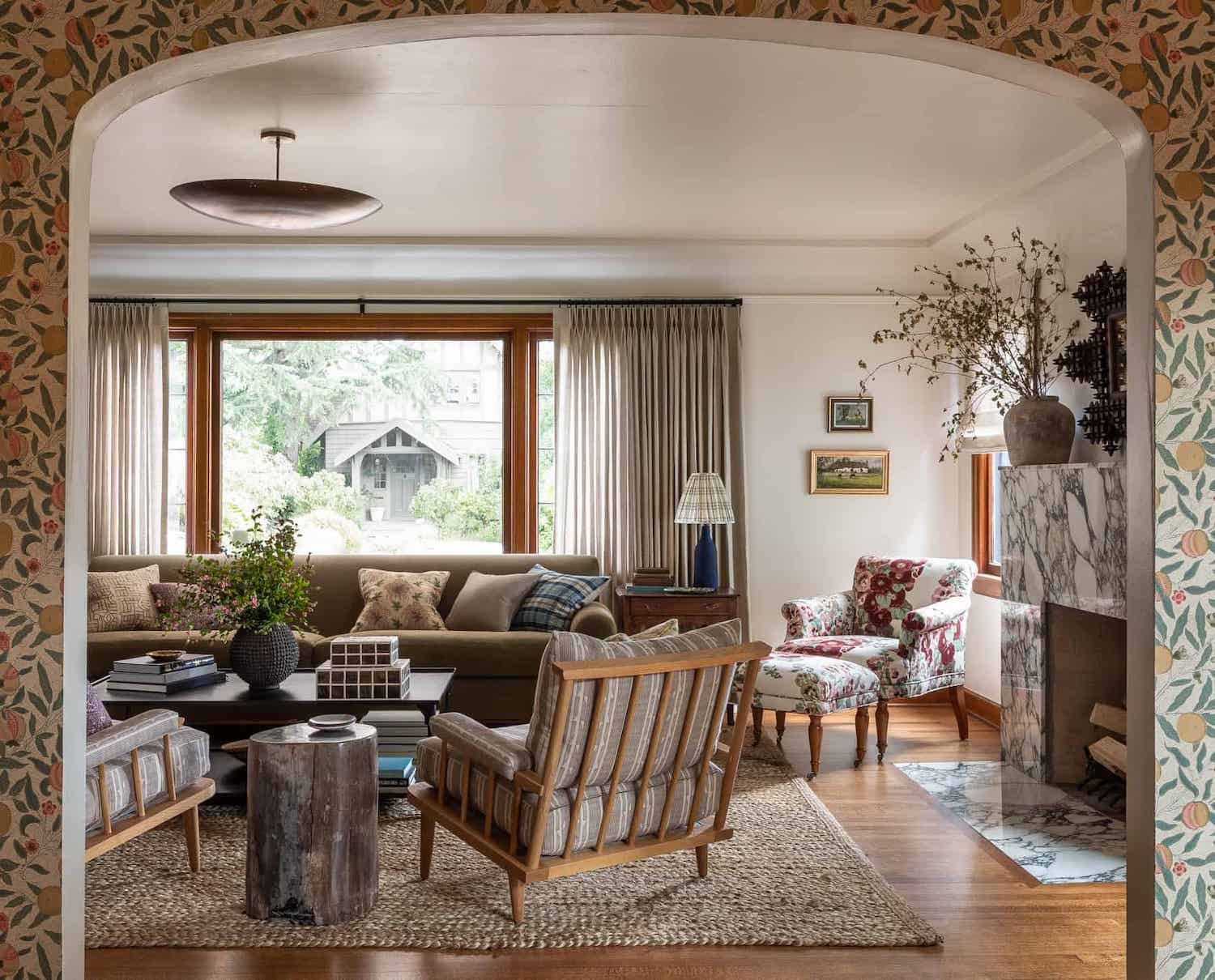
Room Source: Heidi Caillier Design
To help you out, here are three things to remember when mixing patterns:
1. Pick a colour palette and stick to it.
Ideally this palette has 3-5 colours, with a balance of lights and darks, and warm and cool tones. If your palette is primarily colours, be sure to add one or two neutrals to provide balance. Your colours don’t need to match exactly- I recommend my patented “squint-your-eyes” test to see if one colour doesn’t fit in with the rest.
2. Mix up the pattern types.
Patterns can be grouped into general categories- for example solids, florals, abstracts, motifs/repeating patterns and geometrics. Within each of these categories there can be more variations. For example geometric patterns can include stripes, plaids, or geometric shapes like diamonds. It’s okay to include multiples of one pattern type as long as there is enough difference or contrast between the pattern. Which leads me to my third point:
3. Vary the scale of the patterns.
Patterns can be roughly categorized into small, medium and large scale. A mix of the three is what you’re looking for.
Here’s how all three of these concepts work together:
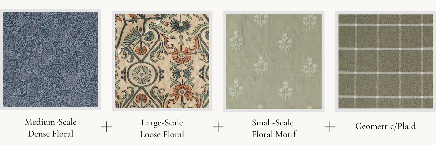
In the grouping below, I used a palette of muted greens, steely-blues, terracotta orange, and a clay-coloured neutral. You can see how the greens don’t exactly match, but nothings stands out when you do the squint test. The multiple floral patterns work because their scale and the density of the print is so different from each other. The geometric plaid on the far right adds structure and contrasts with all the florals. You could also add in a stripe or solid fabric with this grouping.
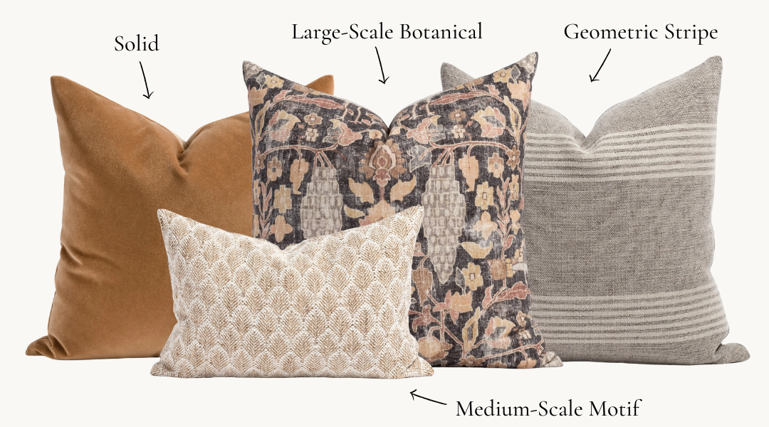
Here’s another example using pillows from one of my favourite online shops, Tonic Living. The colour palette includes shades of brown, ochres, ivory whites, faded black and dusty rose. The botanical print and leaf motif pattern are different enough in scale so that they don’t compete with each other and the simple stripe and solid pillows balance out the busier prints.
Let’s look at a few more fabric groupings. I’ve added pictures of rooms these palettes were inspired by to show you different ways patterns can be used in a space.
A pattern-rich moody bedroom
The queen of pattern, designer Heidi Caillier mixes colour and pattern in effortless and unexpected ways. In this room she uses muted versions of contrasting colours (blue and orange) to make this palette interesting but not too kid-like. The organic lines in the floral and abstract patterns contrast with the straight lines of the geometric prints, creating balance in this collection of fabrics.

Room Source: Heidi Caillier Design
Serene guest room in the country
I can imagine this beautiful bedroom in a Georgian country manor in the rolling hills of England. This palette proves that using multiple patterns in one room can still make for a calming space. The two floral patterns are different enough from each other to work together and the periwinkle blue of the flower petals is similar to the blue in the striped fabric.There are a few different shades of ivory and cream in this palette but they all have a similar undertone.
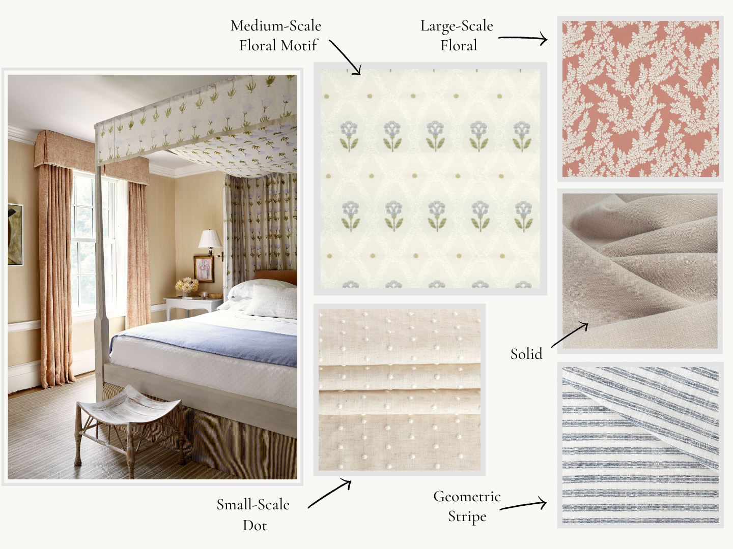
Room Source: McGrath II
Traditional but relaxed living room
I love this room by Sarah Richardson Design. She uses a mix of neutrals that are cool (gray tones) and warm (beige and brown tones). The fabrics chosen for this palette stick to her strict colour palette, and include a few modern patterns to prevent the room from feeling too stuffy.

Room Source: Sarah Richardson Design
I hope these tips made the idea of mixing patterns a little more clear! Would you like personalized help picking patterns for your space? Contact me to discuss your design project or learn more about our eDesign room packages here.